The Open All-Russian Сompetition for the development of the brand of the Black Lake Park
The Open All-Russian Competition for the development of the brand of the Black Lake Park was initiated in 2017 by the Government of the Republic of Tatarstan with the support of the Administration of the city of Kazan. The operator of the competition is the Agency for Strategic Development CENTER.
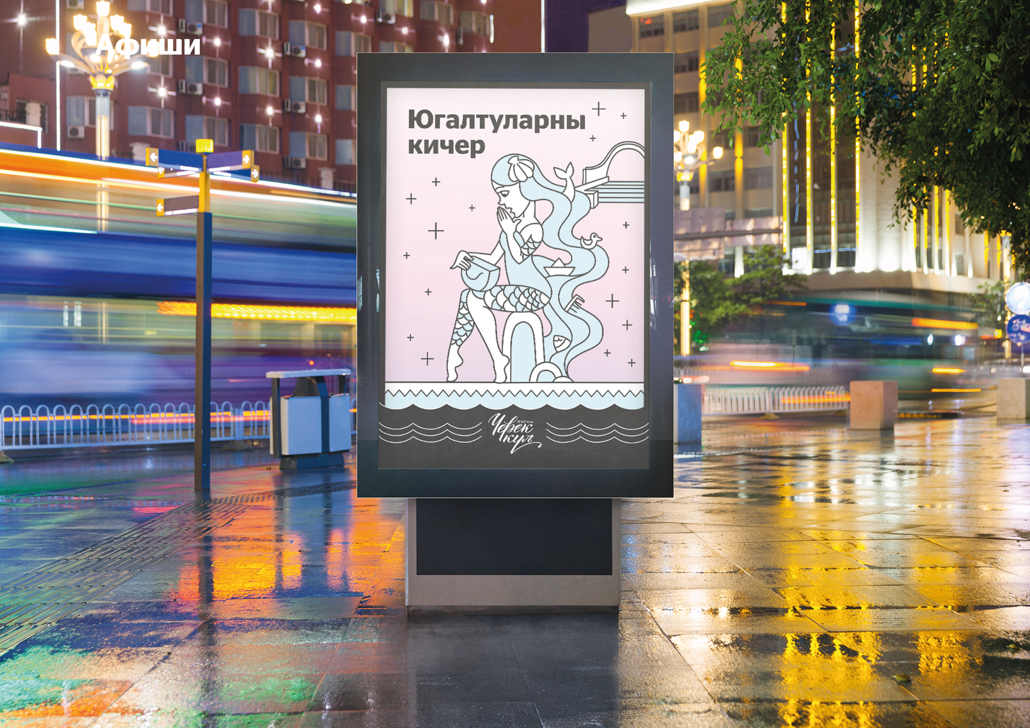
Participants of the competition were to develop a brand platform, come up with a logo, offer identity elements, including advertising, souvenir products and a navigation system. The competition proposal included the brand platform: mission, goals, values, character; corporate identity, including corporate block, fonts, colors, visual and semantic elements; rules for the use of logo and corporate identity elements in business documentation, souvenir, advertising and printing products; park navigation; description of the materials used and the complex techniques of printing and / or manufacturing corporate identity elements.
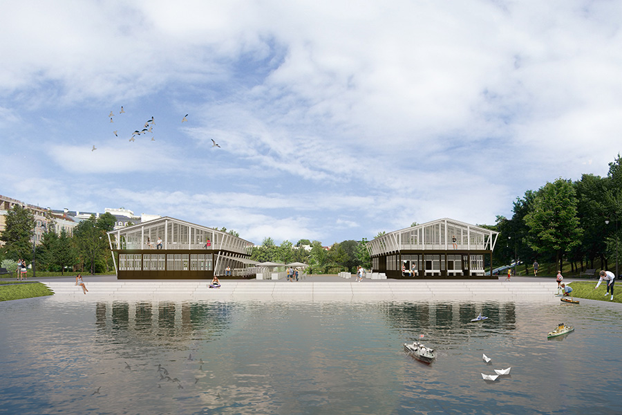
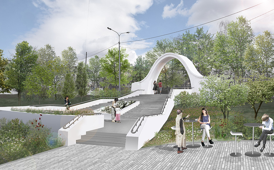
Competitive object. Park "Black Lake", the name of which was given by the reservoir located on its territory, is located in the very center of Kazan. It is included in the list of objects of historical and cultural heritage of the Republic of Tatarstan and is a monument of landscape architecture. The park was built in the second half of the 18th century and is a monument of landscape architecture. The modern park is still a favorite place for citizens to walk. In the spring of 2016, reconstruction of the park began according to a project developed by specialists from the Wowhaus architectural bureau. As part of a public-private partnership, PARADIGMA LLC as an operator, which is responsible for the cultural and event life of the park, develops services, making them convenient and attractive for users.
Objective. To develop a modern park brand that will reflect its history, make an integrated whole with a new architectural look and meet current trends in design and communications. The goals of the competition were the formation of a recognizable image of the park; creating an attractive and understandable brand for a wide audience; ensuring the stylistic unity of printing and souvenir products, documentation and other advertising media; attracting new target groups and strengthening communication with regular visitors to the park; compliance with key areas and current trends in the development of parks in Russia and the world.
Format. Open, All-Russian, two-stage
The participants. Companies and multidisciplinary teams, which include specialists in the field of graphic design, marketing and advertising, with experience in the development of territorial branding.
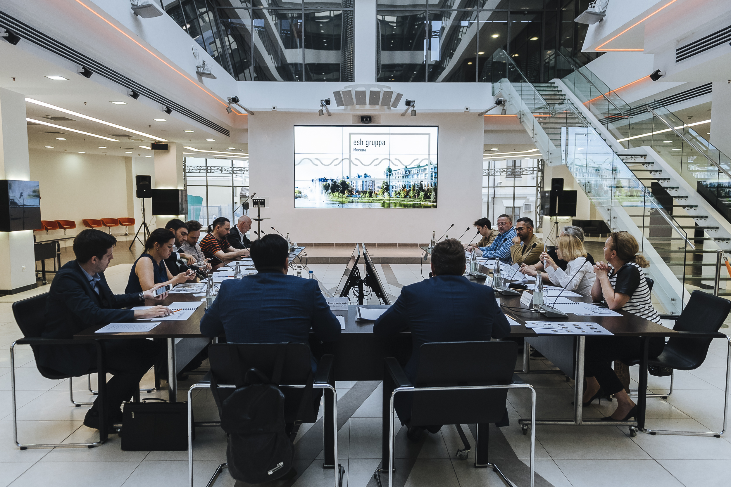
Jury. Experts in the field of graphic design, branding, architecture and the creative industry, as well as representatives of the authorities of the Republic of Tatarstan.
Natalia Fishman-BekmambetovaAssistant to the President of the Republic of Tatarstan, member of the jury

We believe that the appearance of our own brand will make the park even more popular among visitors and recognizable outside the city. We are sure that the contest participants will be able to feel and uncover the unique character of the “Black Lake”.
Finalists. Following the results of the first stage, the jury formed a short-list of 6 finalists. The first three finalists in the ranking received a reward of 100,000 rubles, including taxes and fees.
Prize Fund. The winner will receive a reward of 200,000 rubles, including taxes and fees, and will become an official partner of the Institute of Urban Development of the Republic of Tatarstan in the development of a new park brand.
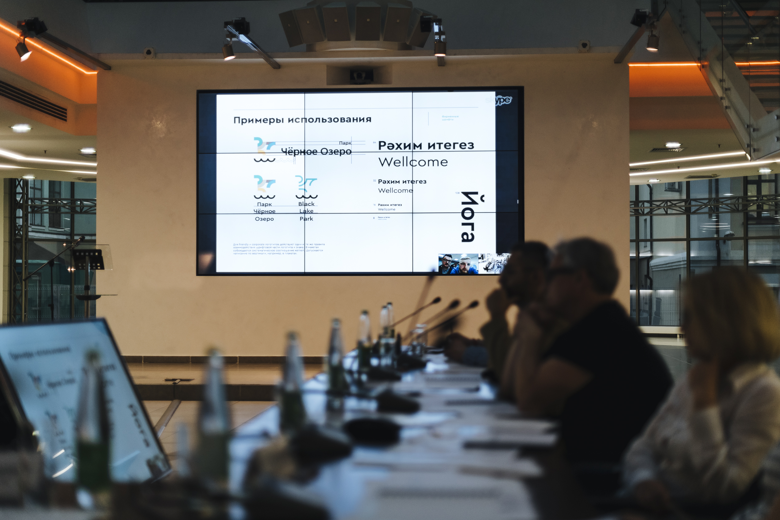
FINALISTS
1 PLACE
Аgency AdWorm and Partners
The contract for the development of the brand of the presidential program "Development of public spaces of the Republic of Tatarstan"
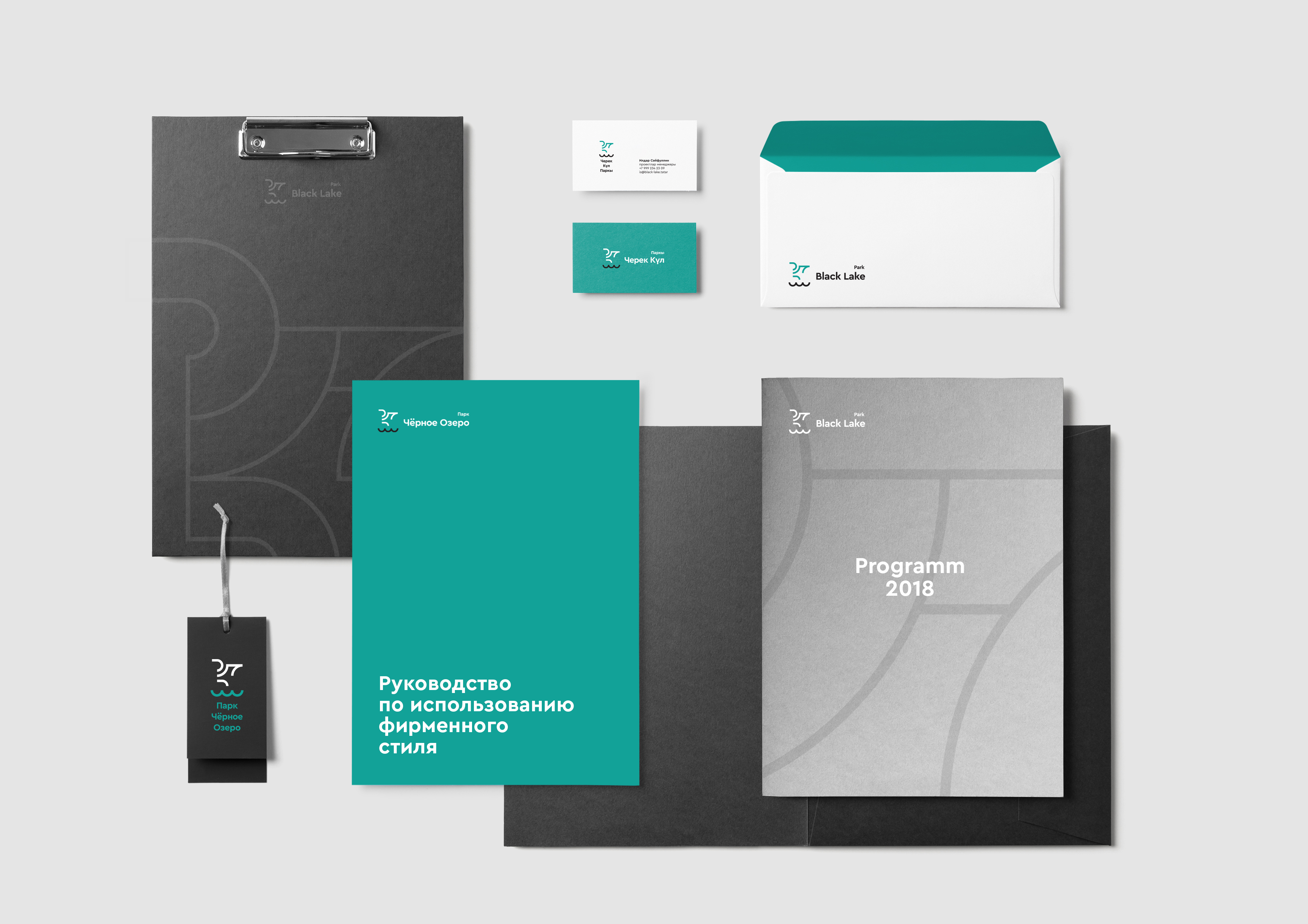
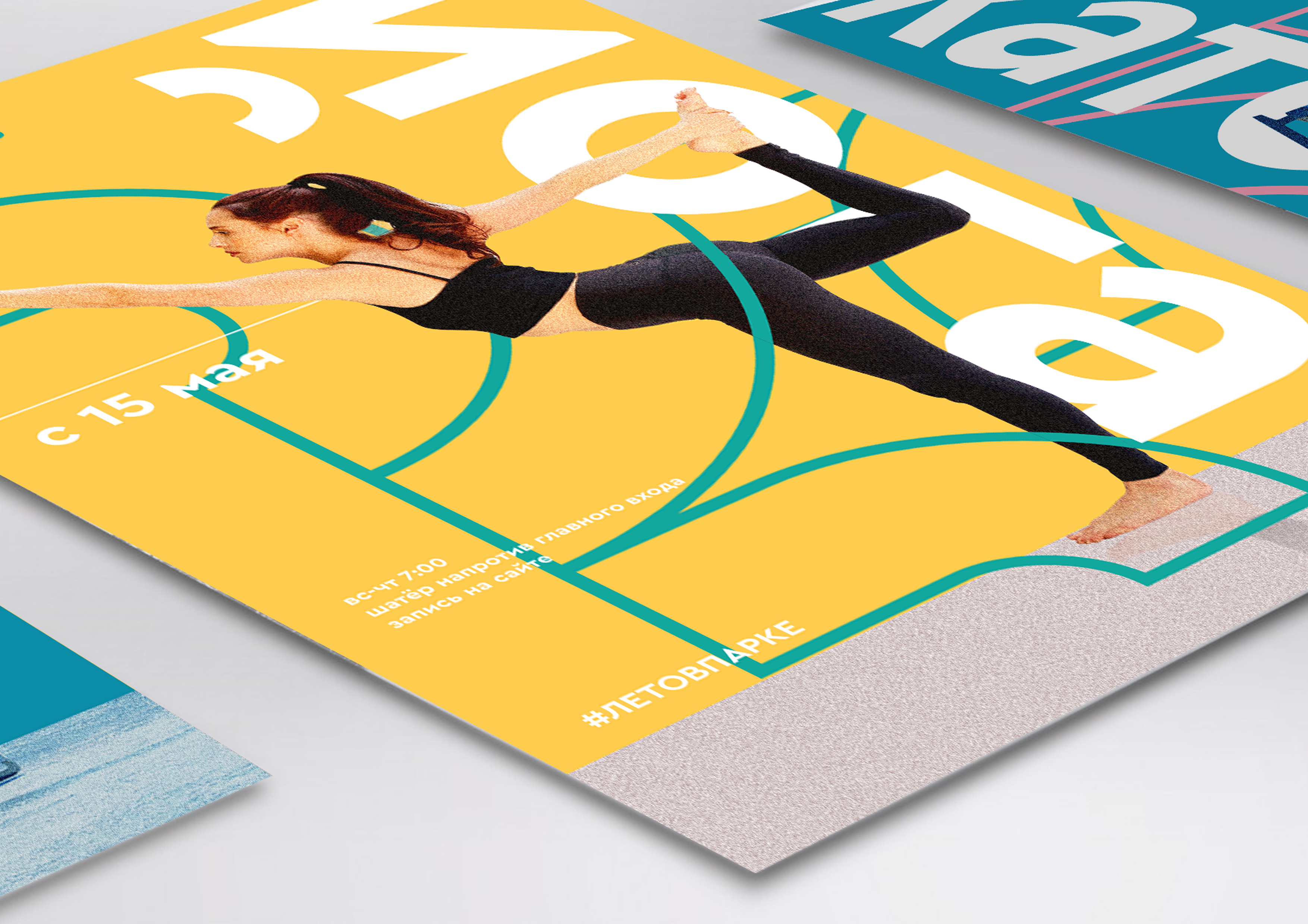
Designers came up with a flexible graphic system of bright elements, similar to the designer, which can be easily applied to various tasks. At the heart of this system is a traditional Tatar floral ornament, rethought in the way of modern trends in graphic design. Corporate identity can be used in two versions - strict, corporate and color, consisting of simple geometric modules.
2 PLACE
Supermarket
The contract for the development of the brand of the Black Lake park, after being finalized according to the technical specifications drawn up by the initiator of the competition and the jury
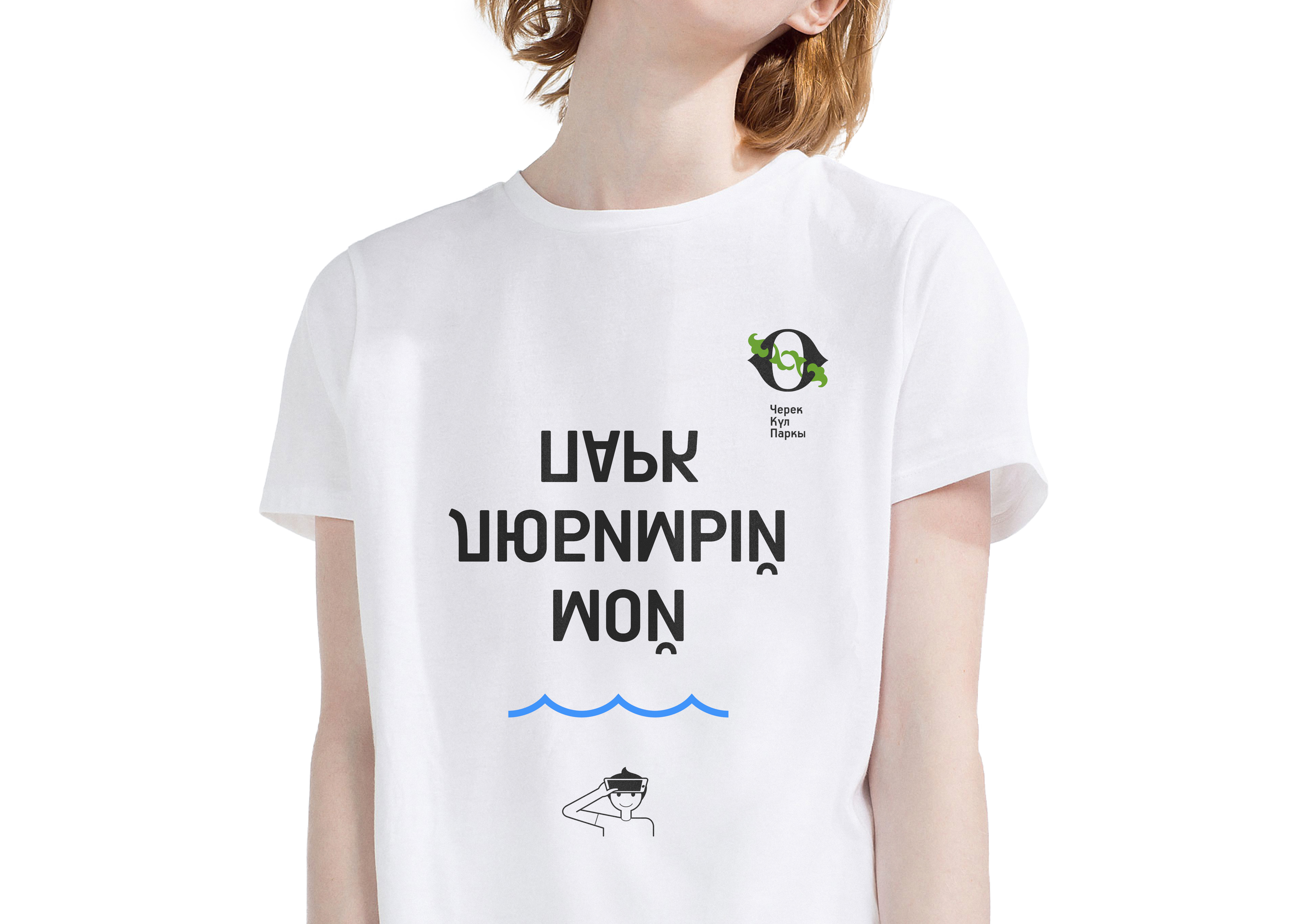
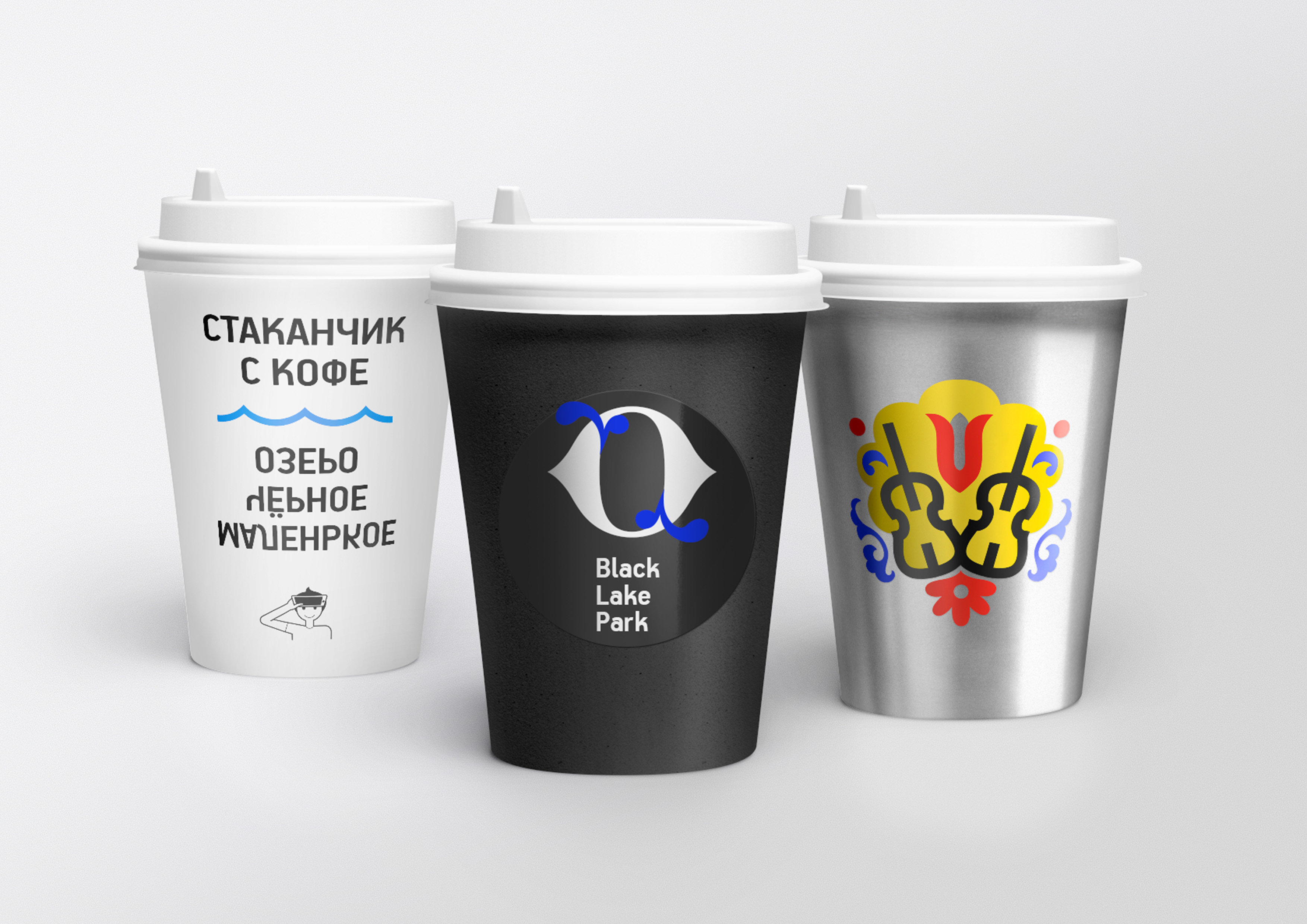
The team put the image of reflection at the heart of the concept. The brand’s metaphor is built on the following: “Look into the Black Lake and you will discover something new for yourself.” Elements of corporate identity contain details of the "puzzle" and unobtrusive "inverted" inscriptions. Decryption can be provided by downloading a special application or by looking at their reflection on the smartphone screen.
3 PLACE
Theory
Special prize of the investor of the Black Lake Park - implementation of the corporate identity of the park cafe
Designers combined the theme of relaxation, aristocracy and intelligence into the concept of Fairytale Park - a place where people relax from the bustle of the city. The atmosphere will be created by fabulous characters and patterns that refer to the Victorian style. The basis of the park cafe proposed by the corporate identity designers was the image of the “black echpochmak”.

Jury
 Ilsur Metshin Mayor of Kazan, chairman of the jury
 Natalia Fishman-BekmambetovaAssistant to the President of the Republic of Tatarstan, member of the jury
 Zhanna Belitskaya Deputy Head of UAiG Kazan, Head of Urban Design Department
 Ilgizar Hasanov Founder of the Smena Center for Contemporary Culture, member of the Union of Artists of Russia, artist
 Alsu Karjakina Director MBU "Directorate of parks and squares of Kazan"
 Dmitry Koshkin Chairman of the Union of Designers of Tatarstan, member of the Council of the Union of Designers of Russia
 Andrey Kozhanov Director of the Graduate School of Branding, curator of the master's program "Brand Strategy", creative director and founder of the branding agency Front: Design
 Igor Kulyazhev Deputy Head of the Executive Committee of Kazan - Chairman of the Committee for External Improvement
 Vladimir Kuzmin Head of the project team "Field Design"
 Oleg Shapiro Partner at WOWHAUS Architectural Bureau
 Tatyana Prokofieva Chief architect of Kazan
 Askar Ramazanov Creator of the educational project Theory & Practice, author of creative spaces DI Telegraph and CHEKHOV APi
 Ilya Ruderman Co-founder of type.today, Moscow Design Studio and CSTM Fonts
 Vladimir Trinos Branding and Graphic Design Expert
 Albert Yuldashev Owner of PARADIGMA LLC, co-investor of the Black Lake Park reconstruction project, Kazan
